Sunday, December 13, 2009

Tuesday, December 8, 2009

on the way


I'm going to make another one before I deliver the sketches tomorrow.

Friday, November 27, 2009


I' dont know if any of these two illustrations are going to be used. They are just samples for different clients on how I work.

Unfinished


This is my from my niese's wedding ceremony. I was going to make a painting of the two, but in the process the file went corrupt and I lost the original work. Sadly this just a screenshot of it...

Can I afford it?


It's fun using myself as model. Even though I made a guy with hair the client recognized it was me...

Monday, September 21, 2009

one of those jobs


This is one of those "I did it because my daughter wanted to give her best friend something special for her celebration" jobs.

I thought this would be an easy cake because my plan was to run the picture of her through the cutout filter in photo shop and leave it with that. (But like many times before, my cunning plan turns out to be not that brilliant after all.) I started about 11.30 pm and found myself yawning in front of my mac at 6 am. This filter is great on complex areas like the hair, but when it came to the fine details like her eyes and mouth I once again had to do it myself in illustrator. And once I start mending tings in illustrator the hours runs by like crazy!
I guess I should have learned by now and said no at occasions like this, but I never do. On the other hand I feel blessed by getting the same tingeling feeling whenever I get the chance to create something, whether it's paid for or not. As long as there is food on the table it really doesn't matter, its all about the joy of creating.

Wednesday, August 26, 2009


I often tend to use warm colors in my work, because I'm just a simple earth color liking guy.
When the client first saw my illustration they really liked it. But after two hours when the printing guys had seen it, they rang me and told me to change the colors to blue or green or something, because my red hues would not work well on rough newspaper! Just use the live color function in illustrator, they told me, and you'll do the makeover in no time.

It is probably something wrong with my illustrator skills, but I spent hours last night trying to make a decent change from warm to cool colors and I'm still not sure if it looks good or not. But I know that If they call me again to make me do more changes I'm going to do a Brad Holland. In one of his lectures he told us about an argue he once had with a client, and he finished his story by saying: "Finally we came to an agreement; I did not change the illustration and they did not print it".


Tuesday, April 21, 2009


Working with logoes again. I have two more to go... but I like to break down and simplyfie complex forms. My aim is to make it as simple as possible. This one ended far from the vage image I had in my mind when I first started, but it kind of looks good after all.

Thursday, April 16, 2009

Sunday, April 5, 2009


Lately I've been making these characters in flash, my main programme at work. Great fun. The girl in the middle is meant to be my colleague project manager, and the bald guy in the back could have been me. They're supposed to move and talk, just a little bit though. For the animating I will try out Aftereffects and see if I can add something more to it this time.

Friday, March 20, 2009

Digital pastels


Sometimes the art directors has images in their head and wants the illustration made in a certain style. In this case the AD had seen some of my prior work and wanted me to create something new but yet in my old style. I got these images to work out from witch suites me just fine.


So I flipped the image and started to work over it...
I usually work from photos. To the right you can still see a small photo of a helmet that I googled on the internet. The man in the front is from my photo library of people I have collected over the years.


And here is the original. I rarely take assignments that lasts for several days anymore, but this one did for sure!

Friday, March 6, 2009


Another draft for a logo. sola taekwon do klubb this time.
I staret out in painter, and than tweaked it in illustrator afterwords.

Saturday, February 28, 2009


This is an idea for a new logo for a cottage rental company. As always I'm trying to talk to the feelings rather than just give information. To do both would be good I think. These cottages are buildt seaside and the obvious thing to do around there is to go fishing.

Sunday, February 8, 2009

Logo for HD


An idea "out on hearing"

Farmer John


A new character made for the weekend, pretty upset because his potatoeplants does not grow as big as they should.

Monday, February 2, 2009

just a little something


this is the first draft of mr. Z


and here is how he ended up to be. real simple with just lines animated in flash.

Wednesday, January 28, 2009

character


This is a very simple character, but I think I have spent 4-5 hours all together from the moment I started. The first hour I searched the internet trying to find something that could inspire me to make my own figure. Then it tok just about one minute to draw the idea on a piece of paper and from there I've been sitting in front of my computer working in illustrator. And yet, I could have easily spent another hour or two to make it look better... (The last ten minutes I used photoshop to make the mirror look on the ground.)

Thursday, January 22, 2009

New year, happy logo


Here is the final result, my first assignment this year.


Then I made these two, because they wanted me to change the emphasize from not only receiving, but equally giving. They liked the one with the people.


So I showed them the sketch and the first draft of the logo. I thought it was a nice metaphor for what they wanted to say, and I still do. But they did not like it, so I had to start all over again.


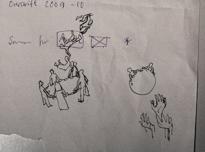
The Imi church asked me to help them make a symbol to express: "together for others" and I came up with this idea of beeing rescued.